Introduction
We all have hundreds, if not thousands, of photos sitting on our phones or hard drives. They capture birthdays, vacations, weddings, and quiet Sunday mornings. But keeping them digital means missing out on the joy of seeing them every day. A photo collage is the perfect solution to bring these memories to life, combining multiple moments into one cohesive piece of art. However, throwing a bunch of pictures together can easily result in a cluttered, chaotic mess rather than a beautiful display.
Creating a stunning arrangement isn’t just about picking your favorite pictures; it’s about mastering the principles of photo collage design. How do you balance bright colors with black and white? How much space should go between frames? Should every photo be the same size? If you’ve ever felt overwhelmed by these questions, you are in the right place. This guide will walk you through the essential design tips to create a balanced, professional-looking collage that transforms your wall into a gallery of cherished memories.
The Foundation of Photo Collage Design
Before you start hammering nails or gluing photos, you need a plan. Great photo collage design starts with a clear vision. Are you going for a clean, modern grid or a relaxed, eclectic mix? Understanding the basics of layout will save you time and frustration later.
Choosing Your Layout Style
The layout sets the tone for your entire display.
- The Grid: Perfect for a modern, organized look. Photos are arranged in straight rows and columns. This works best when photos are uniform in size.
- The Organic Cluster: Ideal for a more casual, artistic vibe. Photos radiate outward from a central piece, allowing for a mix of sizes and orientations.
- The Shape Collage: Photos are arranged to form a specific shape, like a heart or a letter. This is a popular choice for personalized gifts.
If you are struggling to visualize the final result, you can use digital tools to experiment. There are several free online photo collage makers that allow you to drag and drop images into different templates to see what works best before you commit to printing.
Balancing Colors for Visual Harmony
Color is one of the most powerful elements in photo collage design. A mishmash of clashing colors can make your collage feel busy and distracting. To create a harmonious look, you need to be intentional about your color palette.
Stick to a Theme
Look for a common thread in your photos.
- Monochrome: Converting all photos to black and white is the easiest way to ensure cohesion. It creates a timeless, elegant look that fits any decor.
- Warm vs. Cool: Group photos with similar lighting. A collection of golden-hour beach photos (warm) will look naturally cohesive, as will a set of snowy winter landscapes (cool).
- Accent Colors: Choose photos that share a specific color pop, like a red scarf in one photo and a red car in another.
Using Frames to Unify
If your photos are a mix of different colors and styles, your choice of frame becomes the unifying factor. Using identical frames for every piece can tie a disparate collection together. For advice on selecting the right tone for your walls, check out our guide on how to choose frame colors for your room decor.
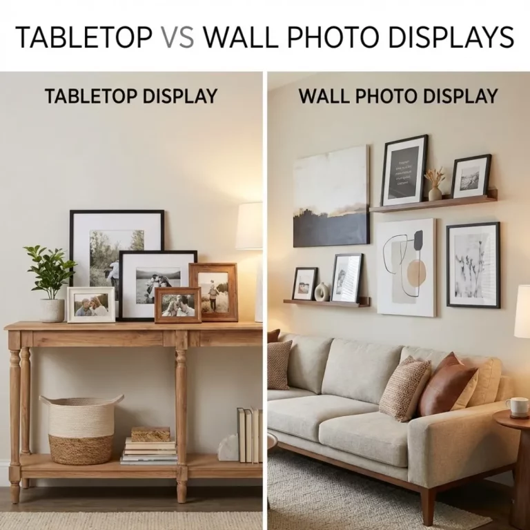
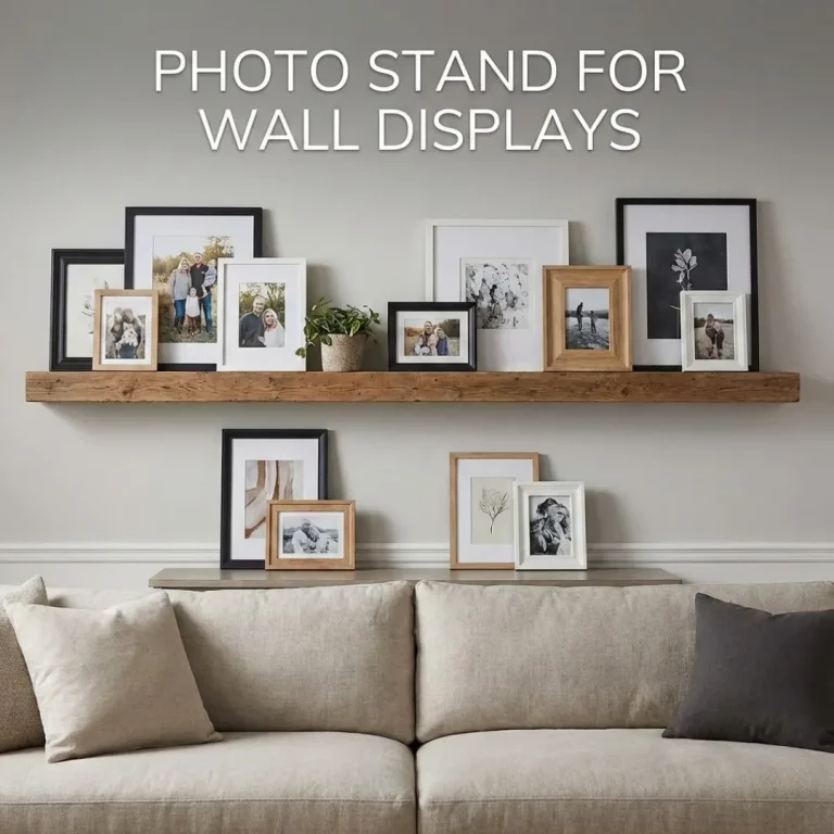
Mastering Sizes and Orientations
Variety creates interest, but too much variety creates chaos. The key to successful photo collage design is finding the sweet spot between uniformity and diversity.
Creating a Hierarchy
Not every photo carries the same weight. Choose one or two “hero” images to be the focal points of your collage. These should be larger than the surrounding photos.
- The Anchor Piece: Place a large frame in the center or slightly off-center to ground the arrangement.
- The Supporting Cast: Surround the hero image with smaller frames.
Mixing Orientations
Don’t be afraid to combine vertical (portrait) and horizontal (landscape) photos. This adds dynamic energy to the layout. However, try to balance them. If you have a vertical photo on the left, balance it with a vertical one on the right. For more specific layout strategies, you can explore mixing frame sizes and orientations to see how different combinations work together.
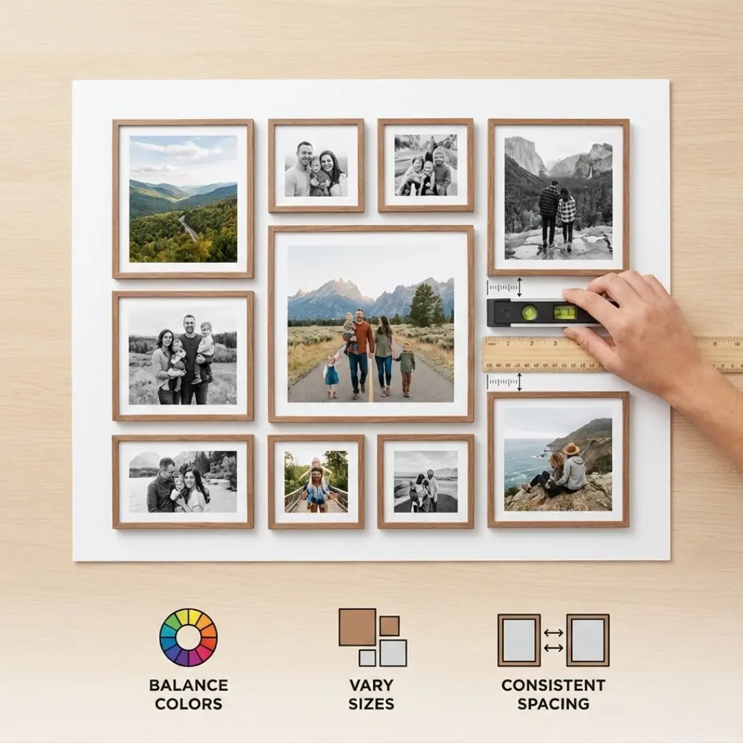
The Art of Spacing
Spacing is the invisible element that can make or break your photo collage design. It refers to the gap between your photos or frames.
Consistency is Key
The golden rule of collage spacing is consistency. Whether you choose a tight 1-inch gap or a spacious 3-inch gap, keep it the same between all frames. This creates a sense of order, even if the frame sizes are different.
| Spacing Style | Distance | Effect |
|---|---|---|
| Tight | 1 – 1.5 inches | Creates a cohesive, single-unit look. Great for grids. |
| Standard | 2 – 3 inches | The most versatile option. Allows each photo to breathe. |
| Wide | 4+ inches | Best for very large walls or small collections to fill space. |
Using Digital Tools for Precision
If you are designing a digital collage to be printed as a single piece (like an acrylic block), spacing is handled by the software. Many platforms offer “smart guides” that snap photos into alignment. If you are creating a physical wall collage, use a tape measure and a level. For a modern, frameless look, you might consider creating a stunning photo collage for acrylic printing, where the spacing is pre-set on a sleek surface.
Pro-Tips for a Polished Look
Now that you have the basics down, here are a few expert tips to elevate your photo collage design.
- Test Before You Hang: Never start hammering nails immediately. Lay your frames out on the floor first to play with the arrangement. Take a picture of your favorite layout to use as a reference.
- Mind the Matting: Adding a white mat board inside the frame adds a layer of professionalism and helps draw the eye to the image. It also provides a visual break between the photo and the frame.
- Consider the Story: Arrange photos to tell a narrative. You could organize them chronologically to show growth or a journey. This technique is often used in chronological photo frame wall ideas for storytelling.
- Don’t Overcrowd: Leave some “negative space” around the edges of your collage so it doesn’t feel like it’s taking over the entire wall.
Conclusion
Creating a beautiful photo display doesn’t require a degree in interior design. By focusing on the core principles of photo collage design—balancing your colors, varying your sizes intentionally, and maintaining consistent spacing—you can turn a collection of random snapshots into a stunning visual story.
Remember, the goal is to create a display that brings you joy. Whether you choose a precise grid or a flowing organic layout, the most important element is the memories you choose to showcase. So gather your favorite photos, start experimenting with layouts, and transform your blank wall into a masterpiece of personal history.
Ready to start your project? You can use online tools to design a photo collage online and see your vision come to life before you print.
Frequently Asked Questions (FAQ)
Q: What is the best distance between photo frames in a collage?
A: A standard and safe distance is between 2 to 3 inches. This keeps the frames close enough to feel like a connected group but far enough apart to let each image stand on its own. For smaller frames, a tighter 1.5-inch gap often looks better.
Q: How do I choose the right wall for my photo collage?
A: Choose a wall that is large enough to frame your collage without feeling cramped. Staircases, hallways, and the space above a living room sofa are classic locations. Ensure the center of the collage sits at eye level (approx. 57 inches from the floor).
Q: Should all photos in a collage be the same size?
A: Not necessarily. While uniform sizes create a clean, modern grid look, mixing sizes adds visual interest and allows you to highlight specific “hero” images. Just be sure to balance larger photos with smaller ones so the collage doesn’t feel heavy on one side.
Q: How can I make my collage look cohesive if my photos are all different colors?
A: The most effective method is to convert all photos to black and white. If you prefer color, try to use identical frames and white matting for every photo. This creates a uniform structure that ties the disparate images together.
Q: Is it better to print a digital collage or hang individual frames?
A: It depends on your preference. A digital collage printed on a single piece of material (like canvas or acrylic) is easier to hang and clean. Individual frames offer more texture and allow you to swap out photos easily later. If you want a modern, sleek look, you might explore acrylic wall art vs canvas to see which material suits your style.
Q: Can I mix horizontal and vertical photos?
A: Absolutely! Mixing orientations makes a collage feel dynamic and organic. A good trick is to pair them; if you place a vertical photo, try to balance it with another vertical one nearby or use two stacked horizontal photos to match the height of one vertical photo.
Q: How do I hang a collage without making too many holes in the wall?
A: Plan your layout on the floor first. You can also trace your frames onto paper, cut them out, and tape them to the wall to visualize the placement. Alternatively, consider using adhesive hanging strips which can hold frames securely without damaging the drywall.